
The function of a coverlines is to attract the target audience into buying the magazine so they want to know more about the topic. An example from this magazine is ‘Weezy Still Hip-Hops Leading Man?' From this the intended audicence can infer what information may follow from the articles inside.
Taglines are usually giving the audience a very brief overview of what kind of content is in the magazine, e.g.’2010: In review, all that was cool, crazy and crass’ or a list of artists names in which the genre of the magazine revolves around.
The main image is used to show the reader who the major story is about and also by having a main image of a singer/celebrity, those who are fans of the singer/celebrity may buy the magazine just because it has a major story of the singer/celebrity that they like. Lil Wayne is the person in the main image and so may attract those who like his music.
The function of a barcode is to allow the purchase of the magazine from the store to the person who is buying the magazine.
In addition this magazine has a blackberry bar code in which is useful in terms of 'new technologies' which an individual can scan this code and it will direct them to a webpage linked to the magazine, which is another way they attract their target audience.
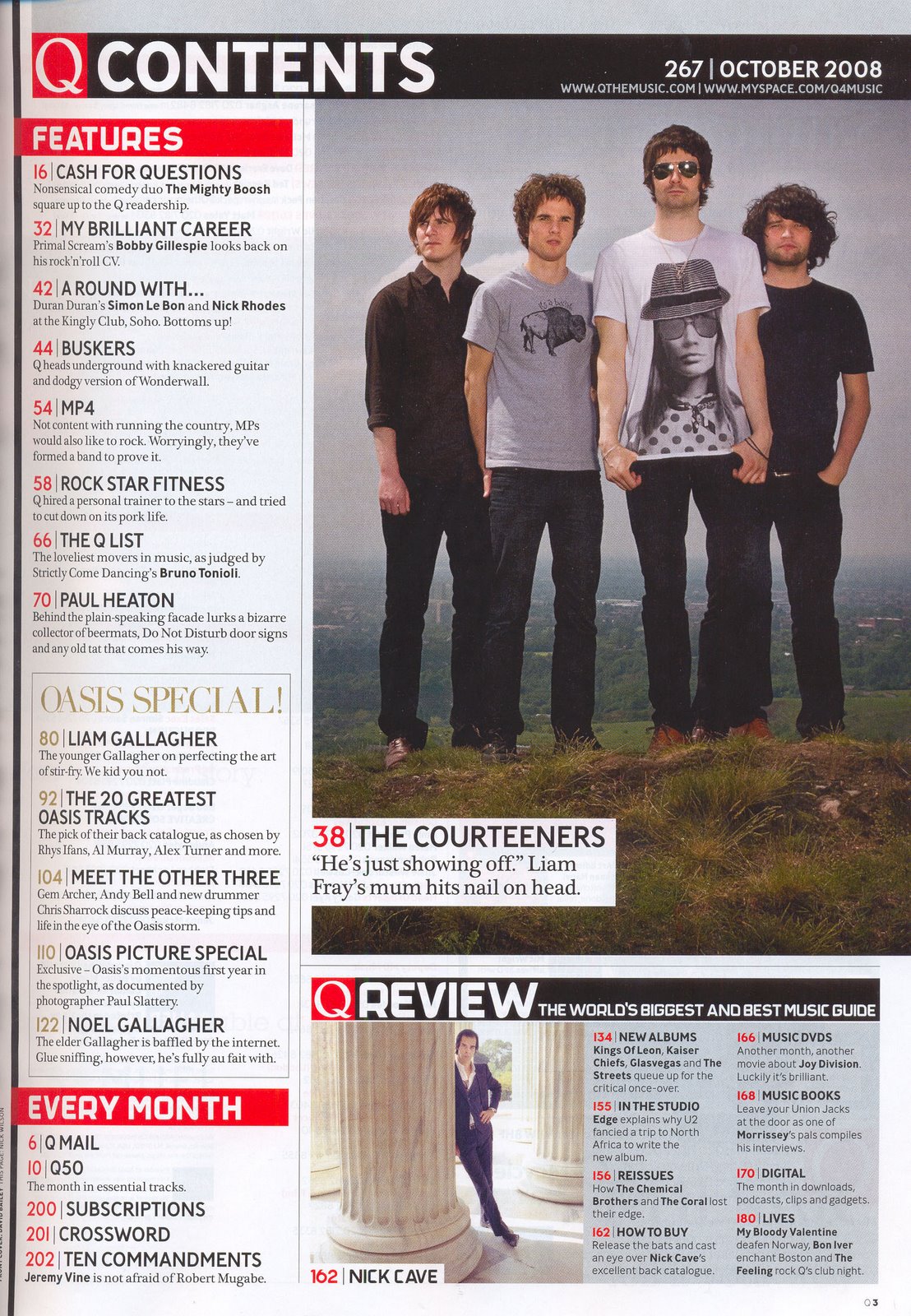
The main image on the contents page is of the band 'Oasis' which is useful to allow the audience to infer and identify what is in the contents page without having to read endless amount of information.
As with many other music magazines, the title on the contents page is ‘CONTENTS’, for the plain reason of letting the audience know that this is a contents page giving the audience a guide as to where each article/topic is allocated. They also have their signature logo on it to allow the readers to identify with magazine already if they have not seen the front page.
As with many other music magazines, the title on the contents page is ‘CONTENTS’, for the plain reason of letting the audience know that this is a contents page giving the audience a guide as to where each article/topic is allocated. They also have their signature logo on it to allow the readers to identify with magazine already if they have not seen the front page.
With Q magazine their format is not set in stone because they have changed their structure a couple of times but always have their logo on the contents page so as to not confuse the reader into thinking it may be another magazine. In this case they have a typical format whereby they have a main image and a smaller image as well as a few sub headings and articles and their pages under the sub headings. This contents page generally uses the colour scheme of red, white and grey. I think the use of a set standard grid format helps the reader to look at the magazine and gives it a sense of professionalism.
These are used for the sole purpose letting the reader know what all the articles under it have in common. In this instance, one of the subheadings is‘women in music’, this lets the reader know it is going to be talking about female singers and females who play instruments and sing. Also, all the articles under the subheadings are in bold which again helps the reader to know what the article is mainly about is a very useful technique to engage the reader into buying the magazine.
Furthermore, another typical convention of this contents page is that it uses the rule of thirds which is that it divides that page up into separate sectors in terms of text and images, which can be seen in various other content pages of different magazines.
I chose this type of lay out because this very magazine appeals to me as a consumer as it uses colours which attract me to it such as black, grey, white and red in which I used in my production in order to keep all of my productions consistent.

The main image is an image of a rapper called Lupe Fiasco, wearing a black hoodie and a gold watch, these items uphold the generic conventions of a hip-hop/R'N'B genre of music. The main image usually takes up most of the double page spread so that it overlaps the second page which shows the significance of the person within the image. Also within the double page spread is a subsidiary image on the top right corner of the double page spread to give an audience an insight of what the articles are bound to consist of. As with all music double page spreads it uses the rule of thirds which is the imaginary line which separates the main image and the articles.
Furthermore, the Pull quote "Fiaso @ 9:30"uses a bold font with a gold colouring to match the rappers watch, which helps maintain it's consistency.
The effect of overlapping the second page of the double page spread is that it attracts the consumer’s attention towards the person within the main image itself rather than to read the information first, it can also allow the audience to identify with the magazine in terms of the content of the magazine without having to read the article, the main image of lupe fiasco acts as an anchorage to the articles displayed on the right side of the page. Additionally, people who consume magazine will be able to pick up the image first since it stands out from the text and allows the customers to identify with the person within the main image quickly so that they may want to know more about the person and why ‘Main streetz’ has chosen him to be in the magazine.
No comments:
Post a Comment